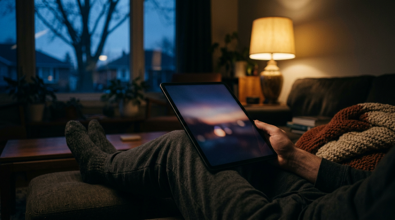
I want to write down why this journal is built for the iPad first, because I know I’ll forget. Some future evening I’ll be tempted to open a desktop browser, see a lot of empty margin, and start “fixing” things.
The reason is simple. This is where I actually read and write. It’s the couch, the end of the day, and the screen held at a slight tilt.
The evening is the real context
After twenty-six years of building for the web, I still catch myself designing for a desk. Desks are where I test things. They are not where I live with them.
The journal gets used after the walk, once the day has settled. A record is playing low. The room is dim, and the screen is the brightest object in it. That one fact should drive most of the decisions.
So the feed isn’t a dashboard. It’s closer to a book I happen to hold with two hands. I don’t want it to feel like a tool I’m operating.
Reading first, writing second
Most nights I read more than I write. I scroll back through earlier days, a Loom tale from last month, a playlist I’d forgotten I made. Writing is the smaller act, and it comes after the reading has put me in the right frame of mind.
That ordering matters for layout. Reading wants a calm column, generous line height, and nothing competing with the text. Writing wants the keyboard to arrive without the page lurching around.
The measure is the thing I most want to protect. A line of text should hold roughly sixty to seventy characters. On a wide landscape iPad, it’s tempting to let the text stretch because the space is there. Don’t. The space is not an invitation. It’s room to breathe.
Full-bleed imagery, with care
The photographs run edge to edge. That’s the cinematic part of the brand, and on a tablet it works. The image becomes the room for a moment, then gives way to the words.
Full-bleed has a cost, though, and I want to remember it:
- Respect the safe areas. The image can bleed, but captions and controls can’t. Anything meaningful stays clear of the rounded corners and the system edges.
- Let the image set the tone, then step back. Text laid directly over a photograph is rarely worth the legibility fight. I’d rather end the image cleanly and begin the text on a quiet dark surface.
- Dark photographs belong here. Dusk, rain on glass, a road at the edge of the light. They sit naturally in a dark interface. Bright, high-key images feel loud in a dim room.
- Plan for both orientations. Landscape gives the picture a wide frame. Portrait turns it into a tall, slow reveal. Both should feel intentional, not like one is the leftover.
Thumbs, and where they rest
On the couch, the iPad is held low and the thumbs sit near the lower corners. The top of the screen is far away. Anything I need often should live where a resting thumb can reach it without a shift in grip.
That means primary actions sit toward the bottom, and nothing important hides in a top corner. Touch targets stay generous, never fiddly. A tap should be forgiving at the end of a long day, when my attention is soft and my aim isn’t precise.
I also want to remember that hands cover things. A thumb resting on the edge will hide whatever is under it, so no critical text should sit right at the margin. The reading column stays inset for exactly this reason.
Light is the quiet constraint
A dark palette isn’t just a mood. It’s courtesy. A white page at night is like someone switching on the overhead light in the middle of a song.
So the palette stays dark and the contrast stays soft but readable. Pure white text on near-black can shimmer and tire the eyes, so I lean toward a slightly warmer, slightly dimmer off-white for body copy. I save the brightest tone for the few things that need to be found.
I want the interface to recede the way a good record sleeve does. It frames what’s inside and then stays out of the way. The Crystal Design System language helps here: clean surfaces, quiet depth, and light that comes from the content rather than the chrome.
What I’m keeping
When I come back to this in six months, here is the short version:
- Design for the couch, not the desk. Test it there, at night, tired.
- Keep the reading measure narrow, even when the screen is wide.
- Let the images bleed, but keep the words inside the safe areas.
- Put the things I reach for within reach of a resting thumb.
- Keep the screen from being the loudest thing in the room.
None of this is a framework or a rule set for anyone else. It’s a reminder of how the thing is meant to feel: private, unhurried, a little cinematic. A place to land at the end of the day, with something playing and the Loom quiet in the corner of the room.
If a layout choice makes the evening feel more like work, it’s the wrong choice. That’s the only test I really need.
Leave a Reply